Decor: What's In? What's Out? Do You Care?
At least a couple times of year I look through magazines (and now online) to see what is trendy, fashionable, and what is not when it comes to home decor. It's been more out of curiosity than anything. I kick myself now a few times wishing I had back what I rid of and replaced with the "newest trend." Now? No more.
Looking through Elle Decor I was happy to see their design ideas for 2020. I do have to laugh a bit, like would most of us really care since we're quarantined? I suppose considering all of the extra time many people have now it does make for a good project, but guests won't be able to admire all of the work until later (after quarantine) - - and then will it still be "in-style?"
Some of the decor ideas that Elle points out that is "In" for 2020, I really like and some of it is already in my home. My thoughts of a few in their 58 photos of their gallery:
IN:
#3 Floral Wallpaper - I thought I would never see that back again, and I put it in my own home back in the 1990s. But then again, I suppose it is a classic that comes and goes.
#9 Grandmillenial style - The traditional designs and blending of classics such as chinoiserie, scallops, natural fiber rugs, and topiaries is lovely. But who knew that Millennials would like such things, especially since it represents their Boomer grandparents. My personal opinion is chinoiserie is lovely - just breathtaking. I have a few pieces here and there but wish I had more.
#11 Bold Monochromatic - Using colors like Cobalt Blue, Kelly Green, or even Aubergine. Good! Just say no to gray.
#13 Layering Old and New - I love this idea blending old with the new or vice versa. The old stuff tells a story. It's literally my decor. It's always been my choice of decor.
#17 Single Print Drama - From the homes of Gloria Vanderbilt and Lee Radziwill, the same print from "head to toe." If it's good enough for Gloria and Lee...
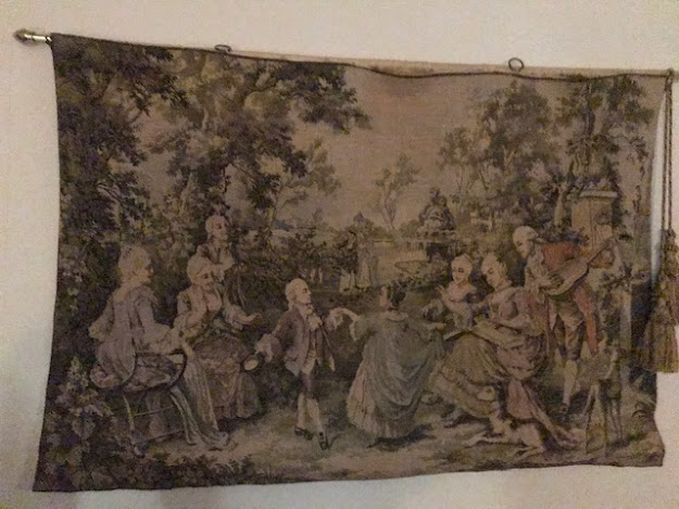
#19 Antique Landscaped Tapestries - This tickles me as I got into buying tapestries back in the early 1990s. It started with a very dirty piece of tapestry that the former husband tried to talk me out of purchasing. It was in an old junk shop and buried in a pile of clothes and old towels. The old heavy piece of fabric looked like silk peau de soie, which is the reason why it caught my eye to begin with. When I turned the fabric over it turned out to be the backing of an old tapestry. The old needle work was in tact, but filthy with very dirty muted colors of gray. The shop wanted $10 for it so I gambled and took it to the dry cleaners. When the former husband picked it up at the end of the week, the dry cleaner's counter person admitted they wouldn't have given the old piece a second look until it was cleaned - the soft colors of sage green, apricot, and lavender just popped. It's a beautiful piece - and of course, the husband smiled and said, "Aren't you glad I talked you into buying it?"
After that, I kept my eye on other pieces of tapestry as I scoured through second-hand stores. My Santa tapestry stays in my guest wing hallway 24/7. It's too beautiful to pack away. I discovered the piece in a beautiful first-rate antique store in Fredericksburg, TX.
#21 Earth Tones - And it's not those harvest golds and greens from the 1960s-1970s. Shades of chocolate brown, wine, olive green, and yellow ochre are all taking over in homes. (And "Cool Tones" are out as per #21).
#31 Classicism - Classicism is back! Busts and Grecian details add the perfect perspective to any contemporary vignette. I love this idea as I don't know any other way. It's the old Greek statues of the Three Graces mixed with Grandma's old quilt. And listed in #30, monochromatic is out, especially those tones in gray.
#39 Rattan and Wicker - It's in! I never knew it was out! I have several pieces of wicker chairs and tables off my lanai-type deck from my kitchen and in my bedroom.
OUT:
#4 The 1970s geometric prints have been replaced for the moment with more feminine Mario Buatta-Esque chintz and granny-chic British florals. That has me really stunned, although I do love the Laura Ashley florals, I think I will skip the chintz.
#8 Traditional Kitchen Islands - Tough! Once you have one it's hard to go back.
#10 Gray on Gray - All I can say is "good on good." Come on people! There are so many beautiful colors on the palette, so stop being so "gray."
#14 Perfection - All I can say is "Thank Goodness!" Give me patina and imperfect paint strokes whether it is by age or with purpose.
#28 Granite Countertops - Say no to granite and say yes to quartz that looks like marble. Had I been in a position to redo my kitchen when granite became a "thing," I would have chosen marble to begin with instead of granite. Marble is especially practical for baking and candy making. However, I wouldn't tell people to immediately rid of granite as it was quite an investment - besides, how can you really go wrong with something from Mother Earth? In #51, it is noted that "faux marble" is in - so that could save on the pocketbook - besides being easier to care for. Wish these designers would get together on counter tops for the sake of an article.
#42 Karate Chopped Pillows - Ummm... Okay. I know they supposedly made a statement, but it was a statement I never "chopped."
#44 Temporary Void Shopping - I think this is excellent advice - and who knew I have been doing it the right way all these years waiting for that perfect piece for that special spot?
#54 Arches Are Out - Well, that is dumb. Why would someone want to remove the original architecture in a vintage home?
#56 All White Kitchen - I disagree there. I don't have an all-white kitchen, but if I had one I would use it as my canvas and take advantage of the seasons with eye-popping colored accessories.
Okay, the point of all of this? I do it out of curiosity and mostly to see if I am "ahead of my time," besides how rigid I am going to be when it comes to change. Chances are pretty great I am not going to go out and change my decor. I will simply wait until it comes back around - - again.
And I reccommend you do the same.


Thanks Catie...Always fun to read your Posts~~~
ReplyDeleteLovely read Catie! I guess I'm bad at decor, I have gray as a base color in my furnishings, old and repurposed. But I use navy and white and splashes of yellow, gold, purples and reds and pinks. Layer layer layer...
ReplyDelete